
This year, everything has been turned on its head. Kitchens became offices, living rooms become classrooms, bedrooms… turned into all of the above. Staying at home, for those privileged to do so, meant adjusting to new workmates of all ages (and breeds), and travel plans that once existed turned into TV marathons and game nights. And with winter days ahead, Pantone’s Color of the Year announcement comes at a time when many of us are looking to refresh our spaces—and we think this year’s selection will surprise and delight you.
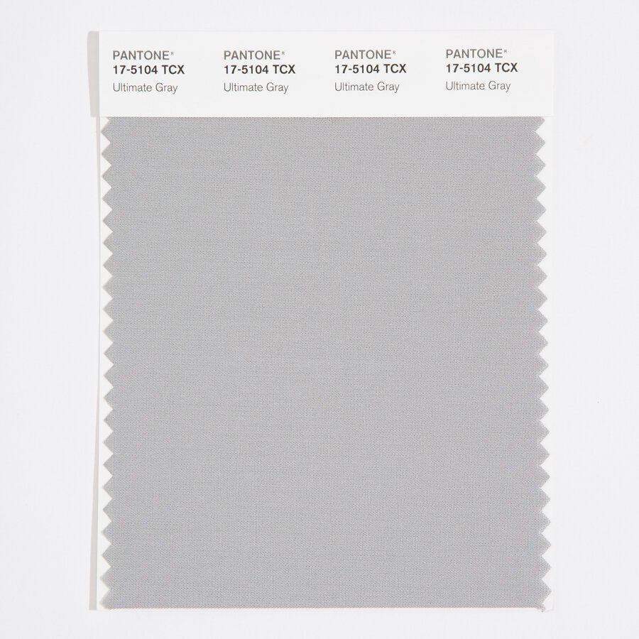
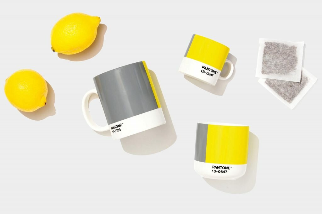
The Pantone 2021 Color of the Year selection is not just one, but two colors: PANTONE 17-5104 Ultimate Gray and PANTONE 13-0647 Illuminating. The hues, which seem starkly opposite, were intentionally chosen to create a balance of “strength” and “optimism”—two characteristics that are needed as we enter the new year.
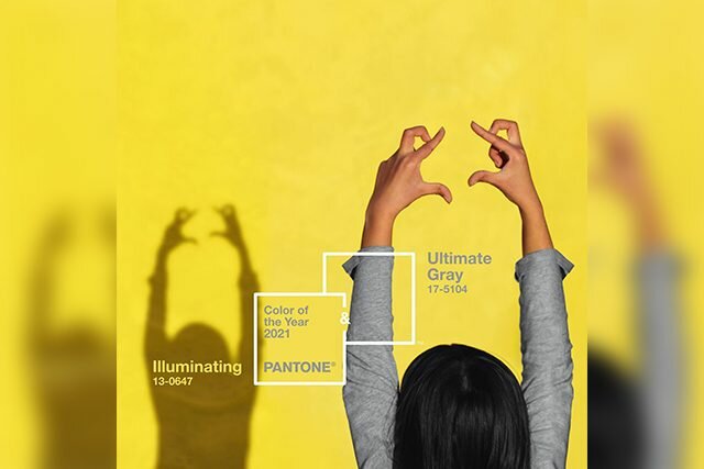
“Practical and rock solid but at the same time warming and optimistic, this is a color combination that gives us resilience and hope. We need to feel encouraged and uplifted, this is essential to the human spirit,” Eiseman said.
Combined, the selection is a grounding-meets-powerful balance that’s needed to get through this difficult time—and is reflective of how we are stronger together as we move into a new year of unknown.
Now some of OUR favorites of the year
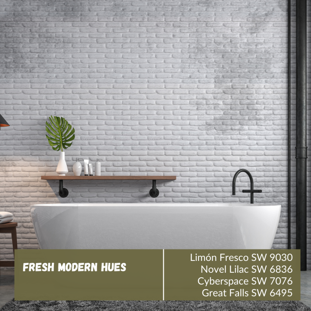
2020 was an interesting year to say the least! Now bringing in 2021, we love fresh modern hues to brighten up any dull room. From the bathroom to the kitchen or the living room, these colors are great to add some personality to your home. Don’t be shy to experiment with some of these new colors to find out which you like best! Here are some of our favorite picks:
Limón Fresco SW 9030
Novel Lilac SW 6836
Cyberspace SW 7076
Great Falls SW 6495
Happy Jewel Tones
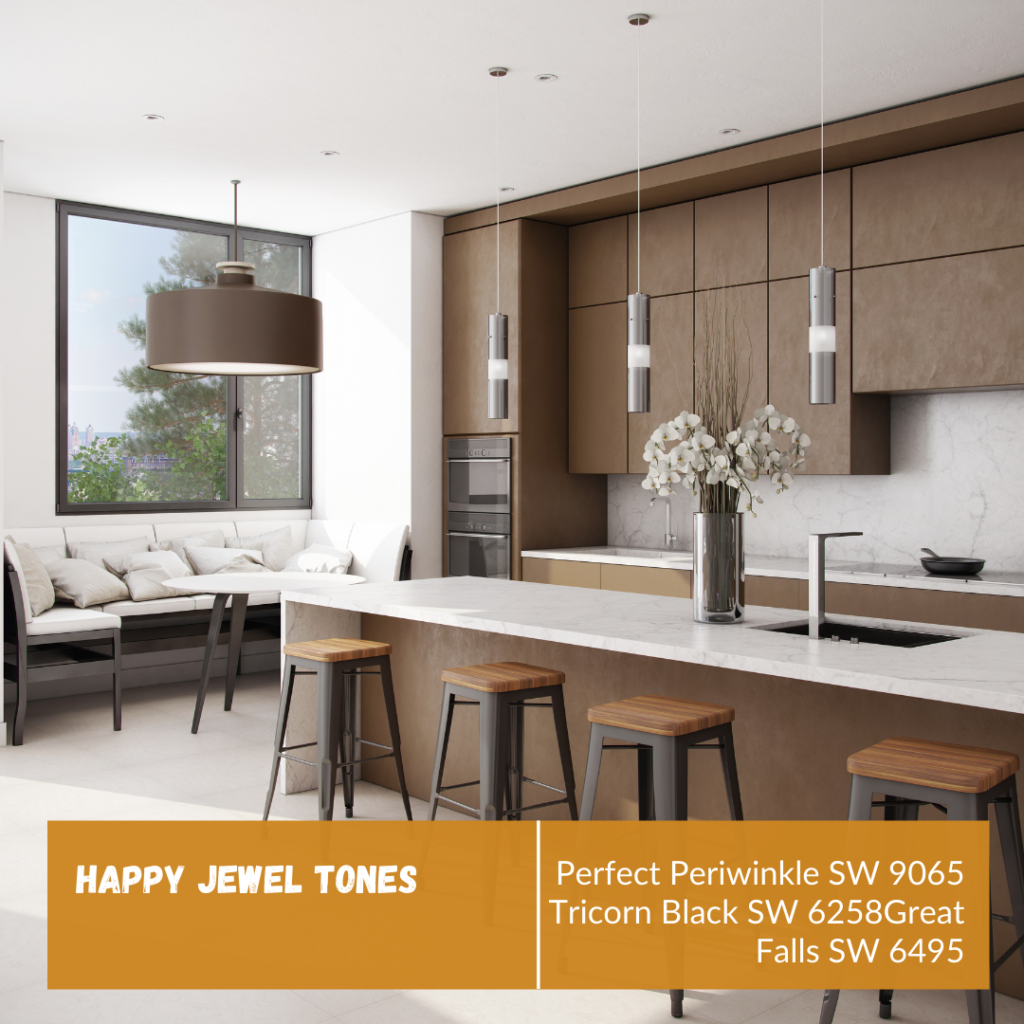
Jewels come from the Earth, and earthy tones in the home can be very grounding for most. Add these colors in your bonus rooms, basement, bathrooms, man caves, and or office spaces. These tones are known to calm the mind while keeping you level headed. As we know many jewels can also be sparkly and shiny, so add a splash today. Here are some of our favorites:
Perfect Periwinkle SW 9065
Tricorn Black SW 6258
Great Falls SW 6495
What are some of your favorite colors in the home? We would love to hear all about them!